1st arrondissement, Paris
An Attraction Map
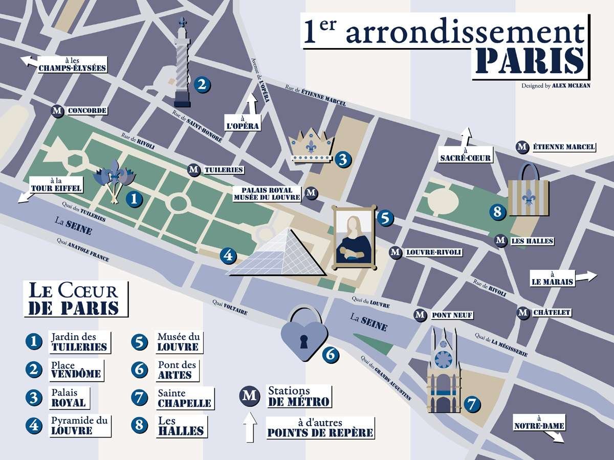
The Project
- A stylized map of local attractions at a destination of our choice, intended to solidify pen tool & layout skills, as well as creating cohesive illustrations as part of the scale-accurate map using a limited color palette. I chose to focus on the 1st arr. of Paris, which contains many of the well-known attractions for which the city is famous.
- My original inspiration derived from the idea of ‘Paris Syndrome’ in which some tourists are hit with severe culture shock as the idealized & romanticized version of Paris does not match the reality of the city. I explored this idea through the type, inspired by the Jean Paul Gaultier logo, and originally wanted to design using a color offset look to the map and illustrated icons.
- Unfortunately, this offset style was not successful in early designs, so I opted for a drop shadow design as well as an alternative, and then worked on two designs concurrently. As time became a constraint, I opted for the drop shadow effect, as the limited color palette inspired by the gray, blue & beige colors of Parisian buildings originally made it difficult for the icons to stand out.
- The original offset idea I had for the map is something I am still exploring and refining. As the project has been completed and there is no more time constraints, I hope to further complete this idea for the map and have a second completed map to show along side the original.
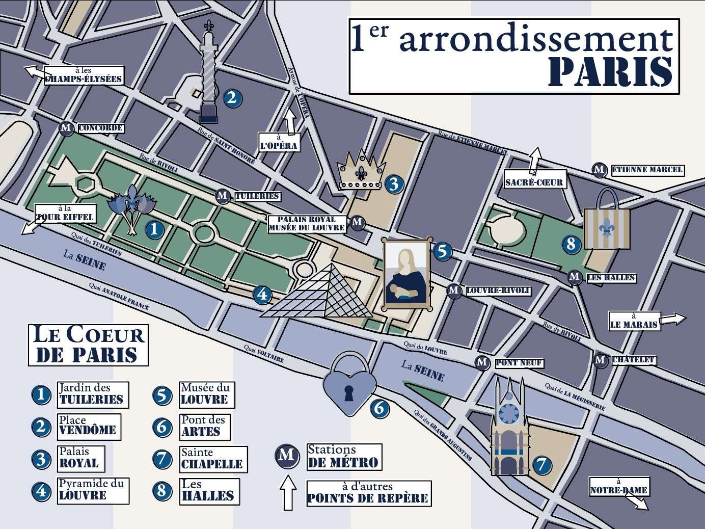
MOCKUPS


